Mídia Ninja
In an era where information is both a weapon and a shield, Brazil’s independent media landscape stands as the final frontier of uncompromised truth. This project outlines the digital evolution of MÍdia Ninja, the nation’s largest independent news powerhouse. By fusing decentralized storytelling with a high-fidelity interface, we are building more than a website—we are constructing a digital agora.
Disruptive Maturity
Designing the new Mídia NINJA platform requires a balance between its raw, "street-level" activist roots and the sophisticated information architecture of a major media conglomerate.
This 3-block walkthrough outlines the transformation of a decentralized collective into a cohesive digital powerhouse.
-
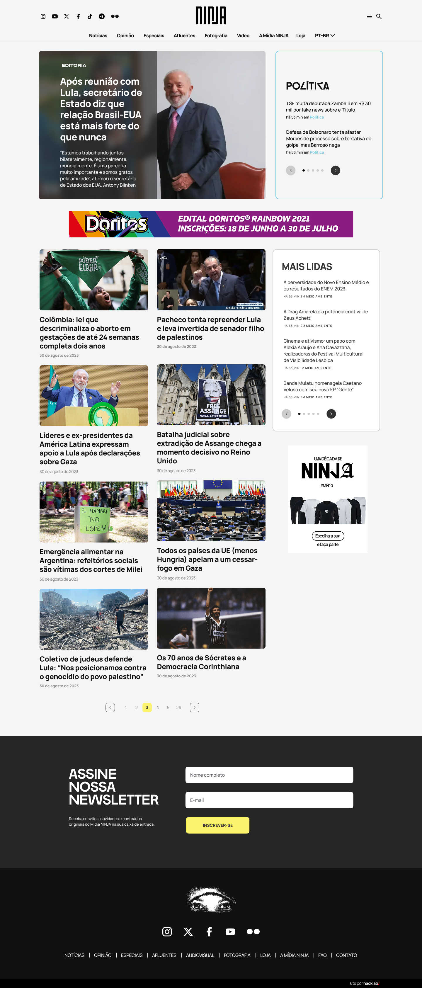
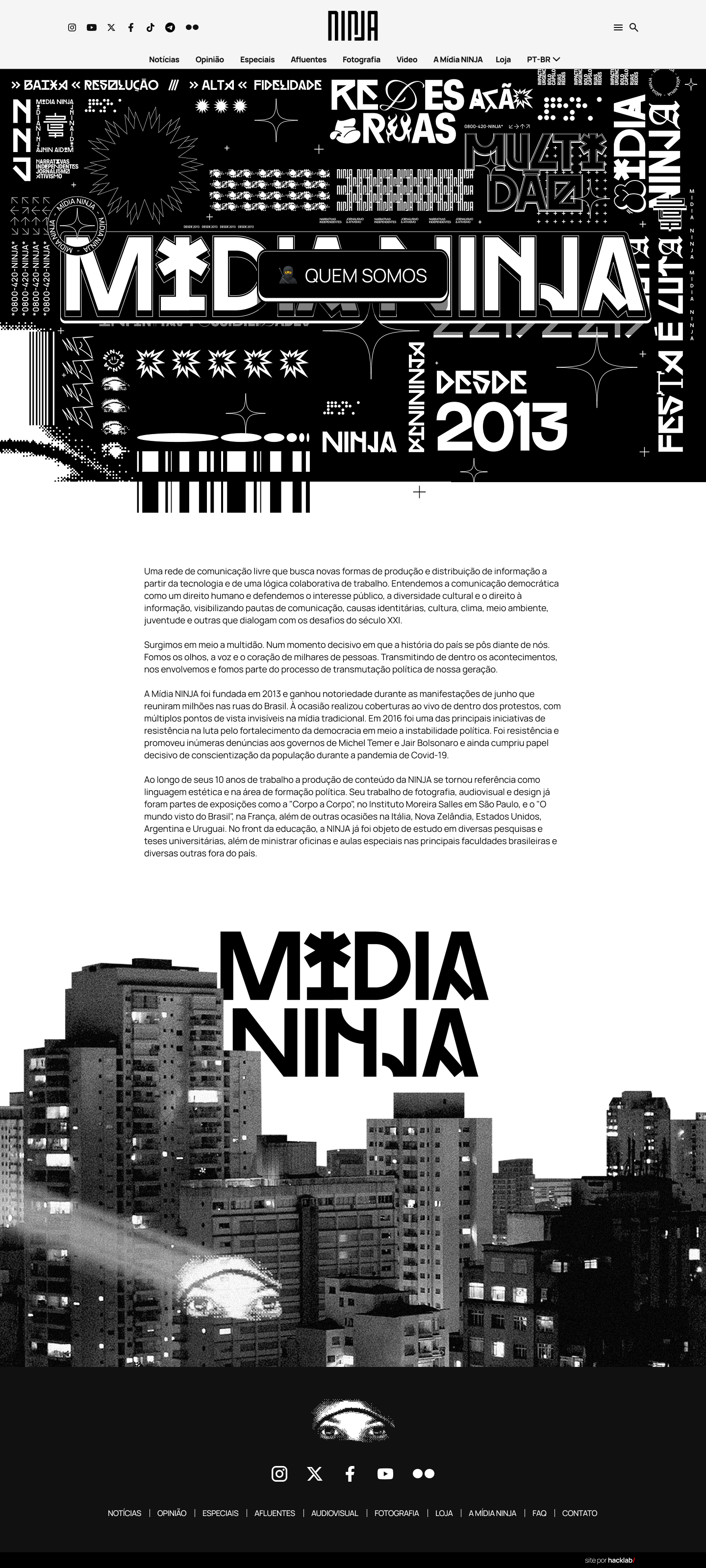
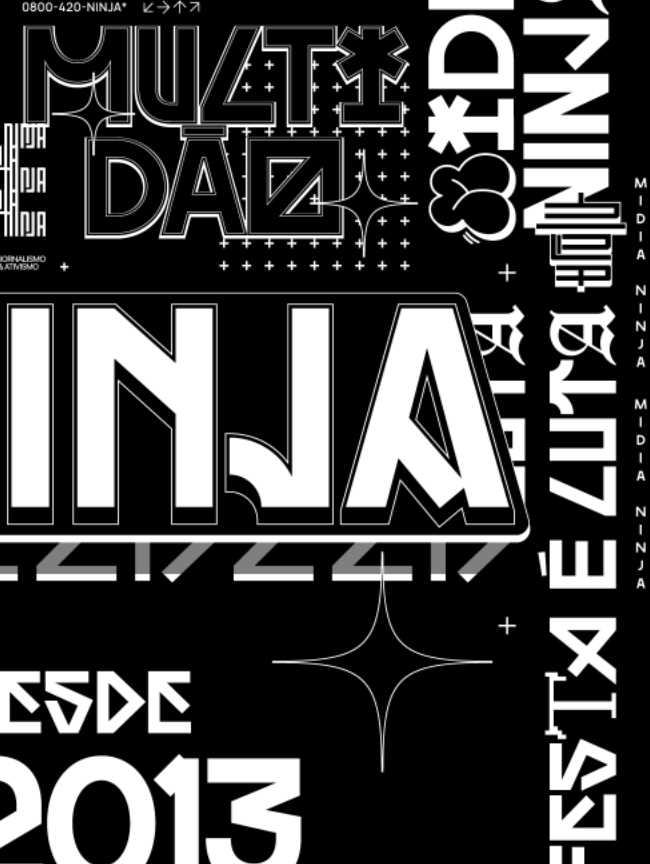
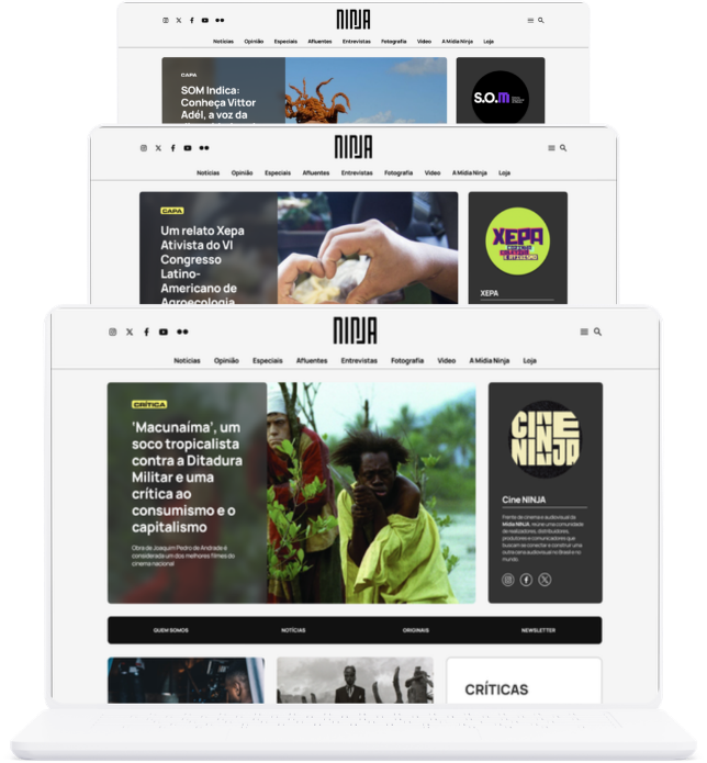
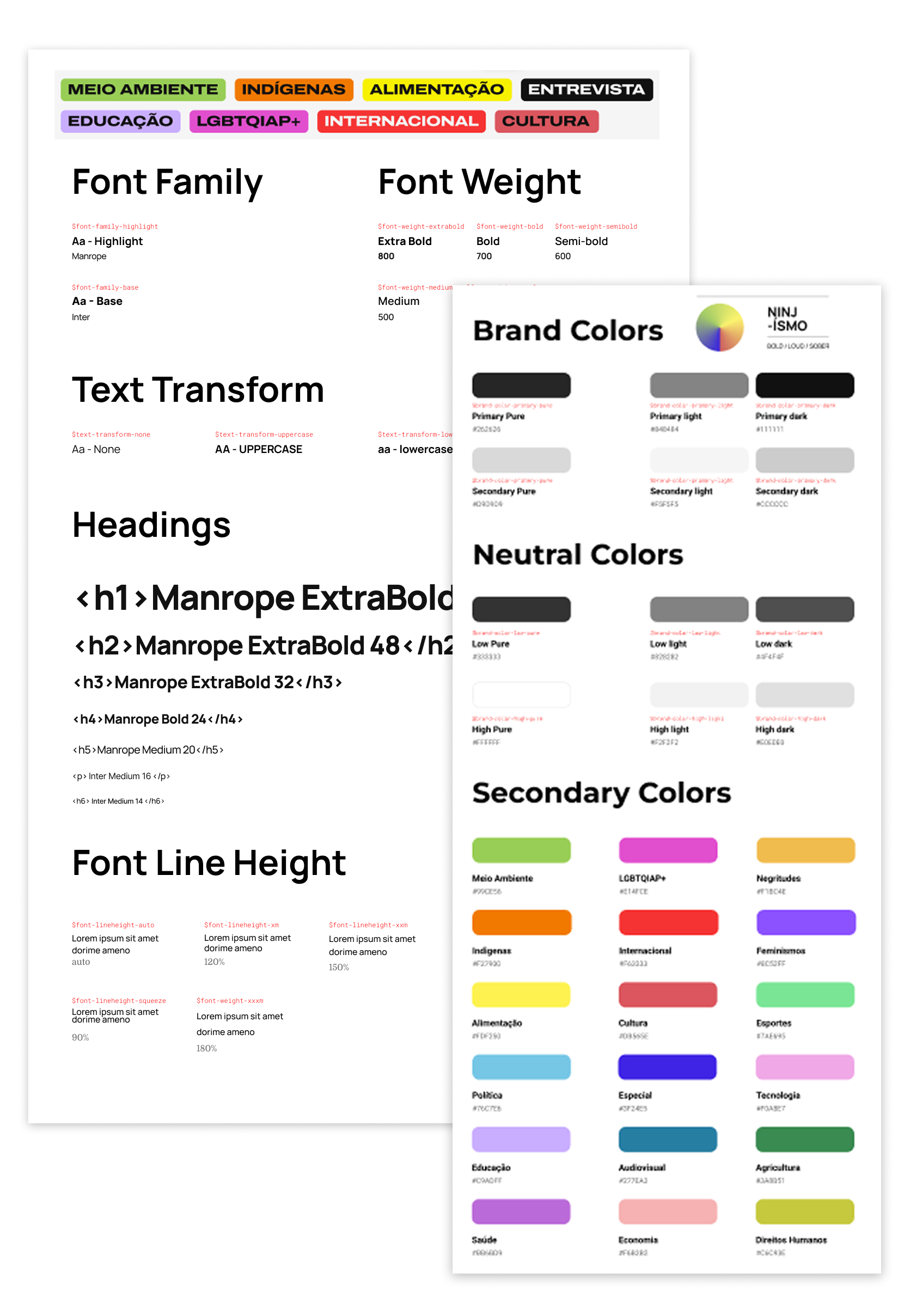
We move away from generic corporate minimalism toward Activist Brutalism. This uses high-contrast typography (impactful sans-serifs), a vibrant yet controlled palette (reclaiming yellow and green through local symbolism), and "analogue-digital" textures.
-
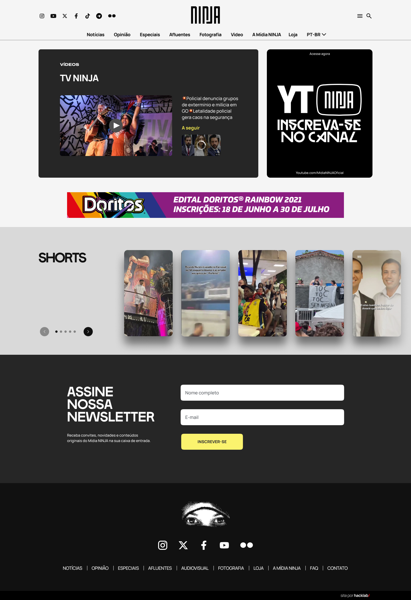
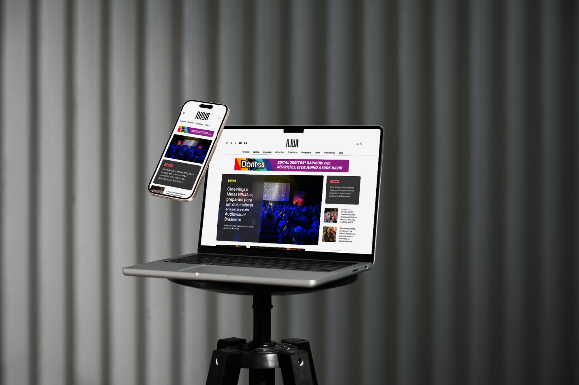
Integration of raw, mobile-first photography and unpolished video snippets as primary UI elements.
-
A signature micro-interaction system where "action" is baked into the UI—loading bars that look like progress meters and transitions that mimic street-pasting (lambe-lambe) posters.
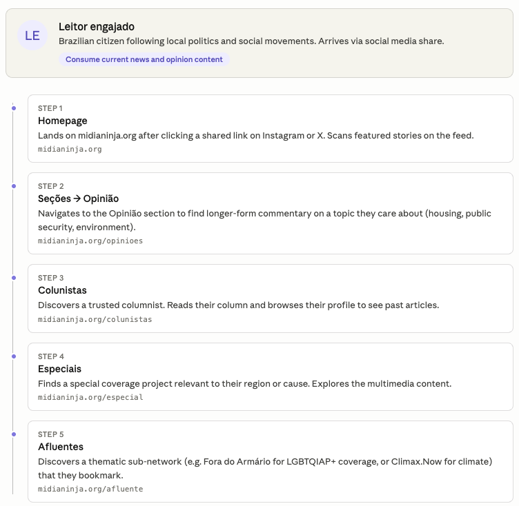
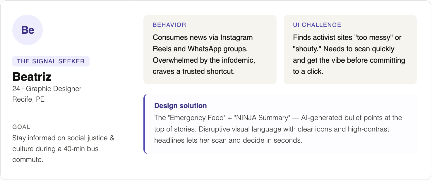
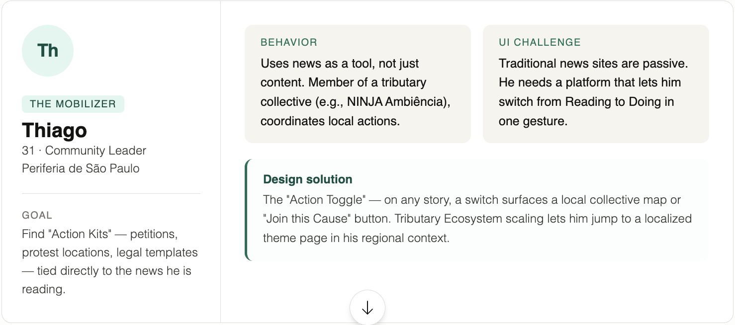
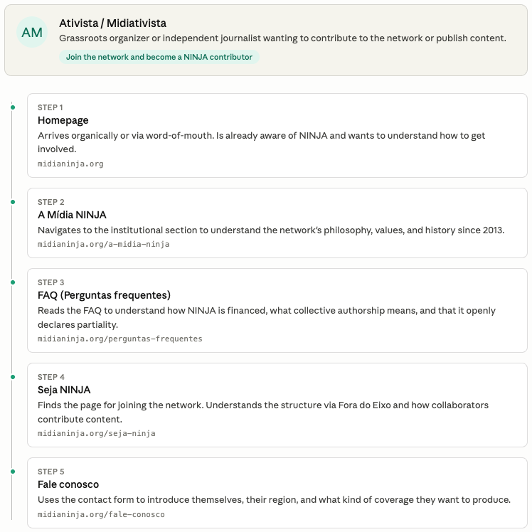
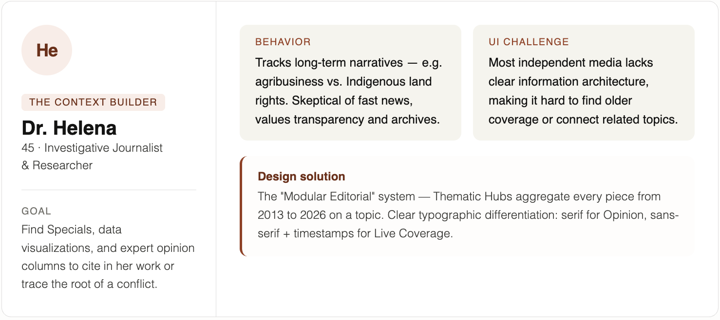
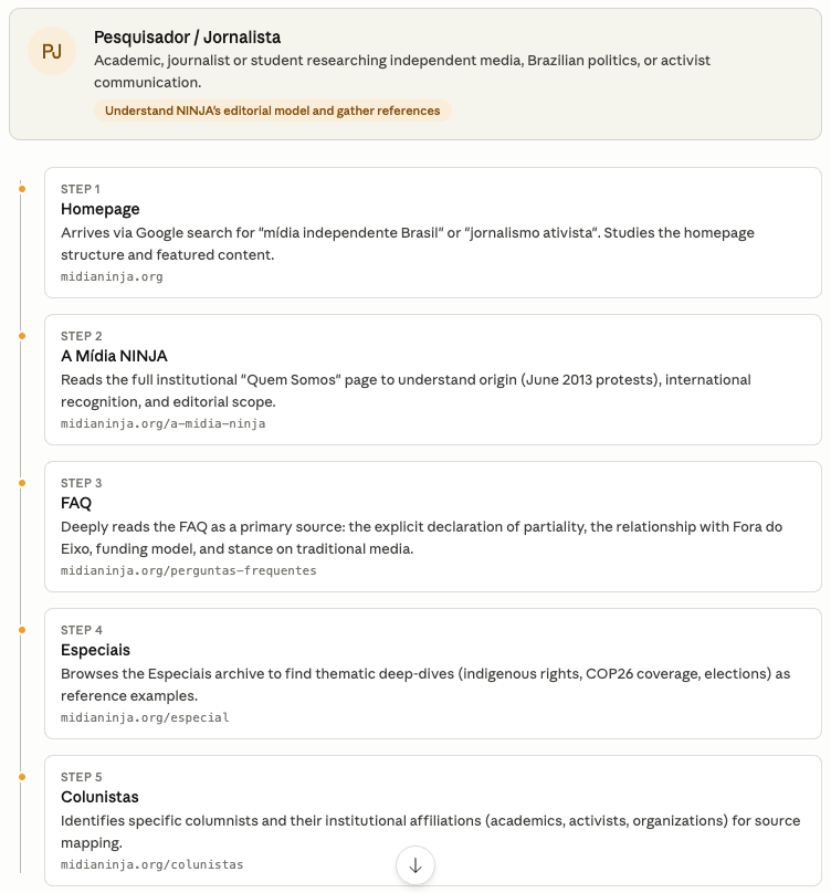
Personas mapping
Tributary Ecosystem
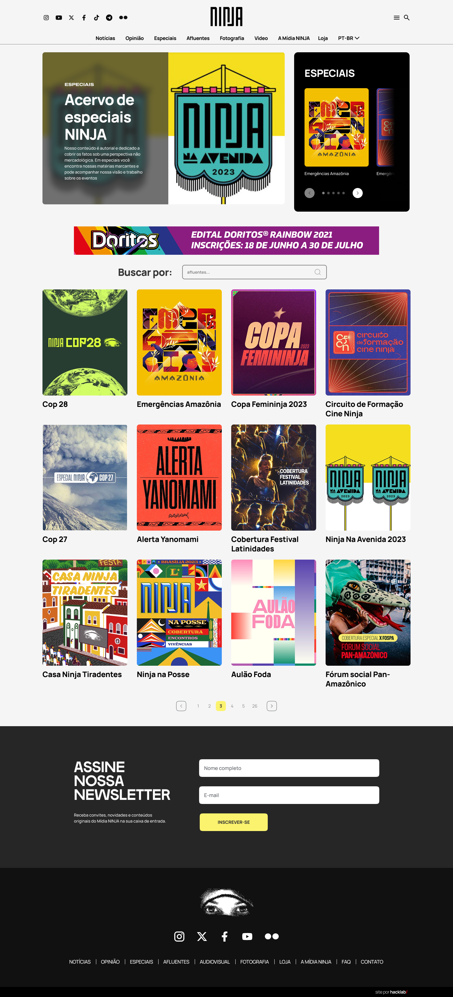
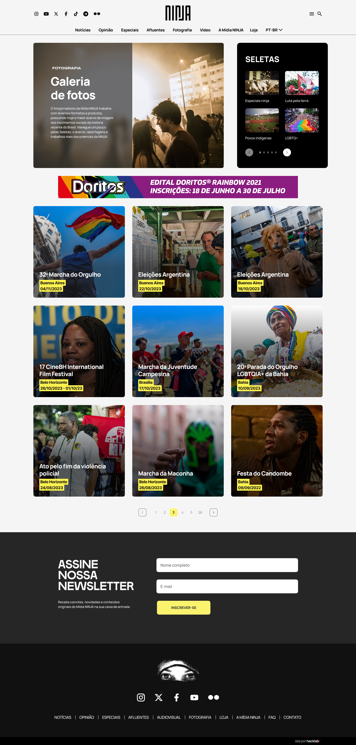
Mídia NINJA is not one newsroom; it is a network of autonomous "verticals" (Cine NINJA, Floresta Ativista, NINJA Esporte Clube, etc.).
The Hub-and-Spoke Model: The entry page acts as a "Social Radar," aggregating live signals from the ecosystem. Each tributary has a designated "Zone" on the home page with its own sub-branding (unique accent colors and iconography) while adhering to the parent grid.
Language Diversification: Rather than a monolithic voice, the UI adapts.
A strict hierarchy is necessary to prevent the "chaos" of independent media from overwhelming the user. We implement a Three-Tier Design System.
Information Architecture
Type
Layer
Design Treatment
Classic news grid, high readability, focused on speed and real-time updates.
Layer 1: The Hard News
Standard reports/bulletins
Typography for long-form reading, prominent "Face-of-the-Author" cards, and immersive parallax scrolling for "Specials."
Layer 2: The Opinion & Special
Columnists and deep-dives
A "War Room" UI style—live tickers, social media embeds, and interactive maps that take over the site’s primary real estate during crises.
Layer 3: The Coverage Hub
Live events